Creating Your First Application
In this guide, we'll walk you through the process of starting with a simple dialog box. We will then add more basic components and make them interactive for users, marking the beginning of your journey with Cumulia WUI.
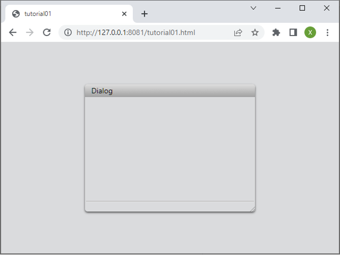
Creating a Dialog Box
In the code below, you will create a Dialog object, define its name and size, and open it. By linking your TypeScript file to the index.html file, you can display a webpage containing the dialog box.
import { Dialog, Size } from 'wui.basic';
import "./theme";

const dialog = new Dialog();
dialog.title = 'Dialog';
dialog.size = new Size(320, 240);

dialog.open();
<!DOCTYPE html>
<html lang="en">

<head>
  <meta charset="UTF-8" />
  <link rel="icon" type="image/svg+xml" href="/vite.svg" />
  <meta name="viewport" content="width=device-width, initial-scale=1.0" />
  <title>Test</title>
</head>

<body>
  <script type="module" src="./dialog.ts"></script>
</body>

</html>
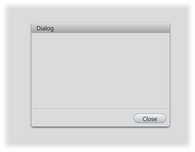
Add a Close Button
To add a close button for manually closing this dialog, we can use the addButtonbutton function. This function enables us to create a button and bind a response function to the button's click event. In this instance, we will define the response function to handle the closing of the dialog.
const dialog = new Dialog();
dialog.title = 'Dialog';
dialog.size = new Size(320, 240);

// add a close button for the dialog object
dialog.addButton('Close', (): void => {
    dialog.close();
});

dialog.open();
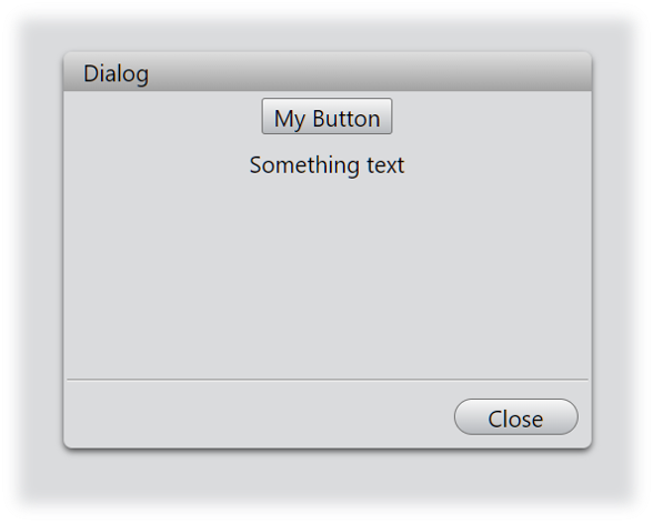
Adding More Components
To enhance the practicality of the dialog, we will add a button and some text, arranging them neatly with a layout object within the interface.
...
const layout = new VBoxLayout(dialog);
new Button(layout, 'My Button');
new Label(layout, 'Something text');
...

dialog.open();
Signal Response
It is common for UI components to respond to interactions from other components, creating an engaging and dynamic user experience. Here, we will implement a simple example: when a user click a button labeled "My button", it will trigger a change in the text of another component.
The following code illustrates this basic interaction pattern. We will bind an event handler to the button's clicked event, which will change the label's content to "Button is clicked". Event binding allows custom handler funcion to execute automatically when the corresponding event occurs. These handler funcion are often defined as arrow functions(or lambda functions) to maintain proper context and provide a clean, concise syntax.
...
const button = new Button(layout, 'My Button');
const label = new Label(layout, 'Something text');
button.bind('clicked', (): void => {
    label.text = 'Button is clicked!';
});
...
This introduction provides a basic overview of the Cumuia WUI component. To fully master its capabilities and features, we recommend diving deeper into the core WUI documentation series.